

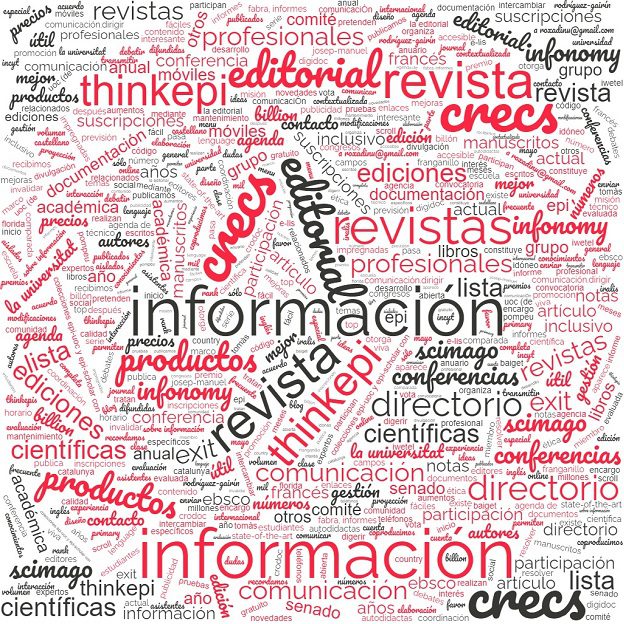
Summary: The visualization of qualitative data has become one of the most important innovations in contemporary qualitative research. Through visual representations—graphs, diagrams, flowcharts, concept maps, and even interactive approaches—researchers can detect patterns, formulate hypotheses, and share findings in a more engaging way. This article will address the fundamental definitions aimed at guiding both beginners and experienced professionals in the art of transforming complex data into practical and actionable insights.
Concepts and Definitions
The visualization of qualitative data relies on certain conceptual and methodological foundations that are worth understanding before applying visual techniques to empirical projects. Understanding these fundamentals ensures the accuracy of the analyses and the quality of the communication of the results.
Qualitative Data Visualization
More precisely, qualitative data visualization consists of the graphical representation of information from texts, audios, images, and videos. The objective, therefore, is to maintain the interpretative and descriptive character that characterizes this analysis. In contrast to quantitative representations—focused strictly on numbers and statistics—the qualitative approach stands out for including formats such as concept maps, relationship diagrams, word clouds, code trees, and, in addition, dynamic flowcharts (Verdinelli & Scagnoli, 2013).
Visual Analytics
the term visual analytics This approach combines data analysis with interactive visualization capabilities. Its main objective is to help researchers explore data in real time, modifying variables and immediately visualizing the impact of these changes (Lundgard & Satyanarayan, 2023). In parallel, this approach gains even more traction in qualitative research with AI. This is because artificial intelligence can analyze massive amounts of data—such as interview transcripts—and consequently generate... insights which can be verified or refined via visual resources.
Multiple Representations
The concept of multiple representations This encompasses the simultaneous use of various types of diagrams, graphs, and images to display different layers of the same dataset (Burns et al., 2023). From this perspective, a code tree can be associated with a concept map or a flowchart to, in this way, make explicit the hierarchies and connections between codes, themes, and subthemes of a content analysis. This creates opportunities for readers and researchers to grasp nuances that a single visual representation would be unable to highlight.
Interactivity
In general terms, the interactivity This allows the user to manipulate the dataset, filter information, and highlight points of interest during the visual exploration process (Burns et al., 2023). This dynamic is particularly useful in qualitative data analysis software such as NVivo, MAXQDA, ATLAS.ti, and, more recently, requalify.ai. These platforms They provide advanced tools. to organize large databases, optimize coding, and visualize correlations between codes and categories, generating valuable insights often through dynamic visual resources.
QDA (Qualitative Data Analysis)
In turn, the acronym QDA (Qualitative Data AnalysisQDA refers to the set of methods used to process, interpret, and display qualitative data. In this context, QDA techniques can integrate manual coding, hierarchical classifications, and advanced text search tools.Therefore, when combined with visual representation, these practices provide an expanded view of the analytical corpus, consequently facilitating the identification of subtle patterns and latent connections (Federico et al., 2014).
Important Questions
How can interactive visualization transform the way we analyze qualitative data?
Interactive visualization tools radically modify analysis by allowing researchers to simulate different scenarios and observe, in real time, the implications of changes in coding or in the selection criteria of the analyzed passages (Srinivasan et al., 2021). Consequently, this dynamism breaks with the linearity of traditional content analysis. As a result, opportunities for heuristic discoveries are created and... insights which arise from unexpected correlations between different categories of data.
What are the benefits of presenting data at multiple levels of granularity?
Primarily, displaying data at varying levels—from the broadest summary to specific details—promotes a holistic view while also allowing for the “zoom"in particular aspects (Weiskopf, 2024). For example, a concept map showing the main categories can be combined with detailed representations that present literal excerpts from testimonies or interviews."
How can different visual formats complement traditional textual analysis?
Various formats such as infographics, flowcharts, correlation matrices, and word clouds help make discoveries more intuitive, reinforcing aspects that might go unnoticed in a textual document (Burns et al., 2023). In this way, the narrative is strengthened, integrating both interpretive aspects and elements of easy visual communication.
What is the role of visual representations in validating hypotheses and communicating results to different audiences?
Visual representations are crucial for speeding up hypothesis validation, as they allow for the immediate verification of correlations and trends. In communicating results, the flexibility of visual elements makes the content accessible to different audiences, broadening the engagement of people without technical training (Burns et al., 2023). This responds to an increasing demand for transparency and responsiveness in academic and scientific projects.
How can visual techniques be integrated ethically and faithfully to the essence of qualitative data?
The key to the ethical integration of visual techniques lies in contextualization. It must be ensured that the representations do not distort the original meanings of the testimonies, maintaining a commitment to fidelity to the participants (Burns et al., 2023). Validating the visualizations with research colleagues and, when possible, with the participants themselves helps to avoid bias and misinterpretations.
Frequently Asked Questions and Errors
Confusion between visualizations for quantitative and qualitative data.
It is common to confuse quantitative visualization methods with the more descriptive representations required in qualitative research. While bar, line, or pie charts are excellent for numbers, in a qualitative context it may be more beneficial to use relationship diagrams and concept maps (Henderson & Segal, 2013).
Exaggeration in the complexity of the graphics.
Including excessive visual elements, with symbols, icons, and arrows beyond what is necessary, can hinder comprehension. Simplicity and clarity are principles that guide good qualitative data analysis and should be reflected in its visualizations (Zhang et al., 2020).
Using visualizations without theoretical basis.
Using diagrams or flowcharts without supporting them with a theoretical or methodological framework can lead to superficial or incorrect interpretations (Lundgard & Satyanarayan, 2023). A tool such as requalify.ai Nvivo should be used in conjunction with a clearly defined coding method (e.g., open coding or content analysis) in order for the visualizations to have epistemological consistency.
Lack of interactivity and multiple representations
The absence of multiple layers and the impossibility of interaction often mean the loss of insights. In software for qualitative data analysis such as Atlas.ti or MaxQDA, interactivity acts as a navigation mechanism between themes and codes that enriches the interpretive process (Federico et al., 2014).
Inadequate validation of visualizations.
Finally, it is essential to validate each visual representation. Researchers can conduct short feedback sessions with colleagues or even participants, ensuring that the visual interpretation of sensitive data is as accurate as possible (Weiskopf, 2024).
Key Topics for Development
Principles of Interactive Visualization
Interactive visualization invites the researcher to “play” with the data, switching layers, altering codes, and exploring interview excerpts to identify unexpected connections. This approach requires technological resources that support the immediate rearrangement of data and analysis techniques such as coding (Henderson & Segal, 2013). Tools like requalify.ai help create such conditions, facilitating automated transcription and visual manipulation of excerpts in real time.
Multiple Representations
Exploring multiple forms of representation—from semi-quantitative scatter plots to concept maps—generates a richer analytical framework (Zhang et al., 2020). This practice enhances the storytelling of research, as it allows for the comparison of diverse perspectives on the same phenomenon, facilitating understanding for heterogeneous audiences, including researchers from other fields and external stakeholders (e.g., public policy managers).
Tools and Software
In addition to established platforms such as Nvivo, MaxQDA, Atlas.ti, and Iramuteq, there is also the proposal of requalify.ai, a software for qualitative data analysis which offers automatic transcription and artificial intelligence capabilities to assist in organizing and visualizing large volumes of data. Each tool has its own unique features: while NVivo and Atlas.ti are more traditional, requalify.ai focuses on agile AI integration and facilitating dynamic visual representations. The choice depends on the project's needs and the researcher's level of familiarity with the technology.
Practical Examples
Climate studies: In climate change research, the use of georeferenced maps helps to display qualitative data from affected communities in combination with quantitative information on temperature or pollution (Burns et al., 2023).
Health: In studies on patient experience, flowcharts and concept maps can make care pathways explicit and identify critical points in service delivery (Henderson & Segal, 2013).
Community development: The creation of thematic maps makes it possible to visualize the needs of different social groups and relate them to existing resources, generating more grounded development projects (Zhang et al., 2020).
Integration with Quantitative Methods
The visualization of qualitative data is not divorced from quantitative methods. Researchers can do joint displaysIn other words, it involves presenting statistical data alongside interpretive information, generating a mixed analysis that deepens the understanding of the phenomenon (Weiskopf, 2024). For example, when analyzing qualitative research with AI, statistics on code frequency can be organized in a graph, while excerpts from interviews are allocated in a diagram to interpret these frequencies.
Historical Context and Current Relevance
Qualitative analysis was, for a long time, predominantly textual. However, the advancement of digital technologies and the emergence of artificial intelligence algorithms have induced a transformation in the way data is collected and interpreted. Currently, data visualization is an intrinsic component of content analysis (Weiskopf, 2024). The adoption of AI-focused tools, such as requalify.ai, further expands this scenario by automating and accelerating transcription and encoding processes, promoting new formats of interactive exploration.
Future Implications
Integration with Artificial Intelligence
The field tends to expand through solutions that use machine learning to discover complex patterns in extensive qualitative databases (Henderson & Segal, 2013). With generative AI, the analysis can include automatic visualization suggestions, pointing out relationships that might go unnoticed to the naked eye.
Expansion of Interactive Tools
The market for qualitative data analysis software is likely to increasingly incorporate elements of simultaneous collaboration and augmented or virtual reality capabilities, enabling multidisciplinary research meetings with integrated real-time editing and visualization (Zhang et al., 2020).
Democratization of Data
The popularization of user-friendly tools and the availability of simple visualization formats can allow people outside of academia to analyze and understand data independently. This reinforces the social value of research, promoting broader participation in the interpretation of facts and in public debate (Weiskopf, 2024).
Methodological Innovation
The creative use of visual representations tends to drive new approaches to qualitative research. Hybrid models that combine observational data, interviews, questionnaires, and social media inputs may culminate in entirely new forms of visualization and analysis (Burns et al., 2023).
Ethical and Representational Challenges
The increasing complexity of visualizations demands heightened attention to the protection of sensitive data. Ensuring that images, maps, and diagrams respect the identity and privacy of participants is a commitment that accompanies any and all applications of qualitative data analysis tools (Burns et al., 2023).
Practical Tips
- Use specialized software: Invest in Nvivo, MaxQDA, Atlas.ti, Iramuteq, or requalify.ai to automate transcriptions, encodings, and create compelling visualizations.
- Combine Representation Types: Implement word clouds, code trees, tables, and flowcharts to enrich the analysis and provide both panoramic and in-depth views.
- Validate Views: Show your representations to colleagues and study participants, listening for criticism and suggestions to avoid interpretive biases.
- Maintain Balance: Avoid excessive visual elements and redundant information, prioritizing clarity in communication.
- Context: Each diagram or graph needs to be accompanied by explanations of how it was constructed and what it represents.
- Be Creative: Don't hesitate to explore artisanal and innovative approaches that may reveal unusual dimensions of qualitative data (Burns et al., 2023).
Conclusion
The visualization of qualitative data opens up exciting possibilities in qualitative research. Through interactivity, multiple representations, and the ethical use of AI tools, it creates space for deeper and more efficient analyses. Accessible visual resources not only translate complex data clearly but can also engage diverse audiences, promoting transparency and collaboration in science.
In this scenario, solutions like requalify.ai — which integrate automatic coding and transcription with visual analytics resources — indicate a convergence between technology, methodological rigor, and accessibility of results. As the field advances, new approaches are expected to raise questions about what defines a "faithful" representation and how to balance interpretive accuracy with visual clarity.
If you want to understand how to perform qualitative data analysis more broadly or deepen your content analysis practice, explore the different functionalities offered by software for qualitative data analysis. In particular, we recommend trying requalify.ai to visualize your data intuitively, while maintaining the integrity and rigor of your research.
Frequently Asked Questions
What are the advantages of using software like requalify.ai for visualizing qualitative data?
THE requalify.ai It offers automated transcription and AI features that simplify encoding and displaying multiple representations, streamlining workflow and pattern discovery.
Is it possible to combine quantitative and qualitative data in the same visualization?
Yes. Joint displays They help to represent statistical results alongside descriptive interpretations, offering a more complete overview of the phenomenon being researched.
How can we ensure ethical practices when visualizing qualitative data?
It is essential to anonymize participants, obtain adequate consent, and validate representations to avoid distortions, ensuring respect for privacy and the veracity of information.
Is there a risk of losing nuance when transforming text into infographics and diagrams?
If visualizations are based on sound methodological principles and undergo validation with colleagues or participants, the essence of the data is generally preserved. Ideally, different levels of detail (text and image) should be combined.
What free tools can be used for visualizing qualitative data?
Softwares like Iramuteq and trial versions of other tools provide a good basis for analyzing and creating initial visualizations. However, more complete solutions, such as requalify.ai, Nvivo, MaxQDA and Atlas.tiThey bring additional professional resources.
Can I use qualitative data visualization for scientific publications?
Yes, and it's even recommended. Many journals and conferences value the clarity that visual representations add to theoretical and methodological discussions.
Bibliographic References
- Burns, A., Xiong, C., Franconeri, S., Cairo, A., & Mahyar, N. (2023). How to evaluate data visualizations across different levels of understanding. https://par.nsf.gov/servlets/purl/10350287
- Federico, P., Hoffmann, S., Rind, A., Aigner, A., & Miksch, S. (2014). Qualizon graphs: space-efficient time-series visualization with qualitative abstractions. AVI'14: Proceedings of the 2014 International Working Conference on Advanced Visual Interfaces, 273-280. https://doi.org/10.1145/2598153.2598172
- Henderson, S., & Segal, E. H. (2013). Visualizing Qualitative Data in Evaluation Research. New Directions for Evaluation, 139. https://doi.org/10.1002/ev.20067
- Lundgard, A., & Satyanarayan, A. (2023). Accessible Visualization via Natural Language Descriptions: A Four-Level Model of Semantic Content. IEEE Transactions on Visualization and Computer Graphics, 28(1): 1073-1083. https://doi.org/10.1109/TVCG.2021.3114770
- Srinivasan, A., Nyapathy, N., Lee, B., Drucker, S. M., & Stasko, J. (2021). Collecting and Characterizing Natural Language Utterances for Specifying Data Visualizations. ACM Conference on Human Factors in Computing Systems. https://doi.org/10.1145/3411764.3445400
- Verdinelli, S., & Scagnoli, N.I. (2013). Data Display in Qualitative Research. International Journal of Qualitative Methods, 12(1), 359-381. https://doi.org/10.1177/160940691301200117
- Weiskopf, D. (2024). Bridging Quantitative and Qualitative Methods for Visualization Research: A Data/Semantics Perspective in Light of Advanced AI. https://arxiv.org/abs/2409.07250
- Zhang, J.E., Sultanum, N., Bezerianos, A., & Chevalier, F. (2020). DataQuilt: Extracting Visual Elements from Images to Craft Pictorial Visualizations. ACM Conference on Human Factors in Computing Systems. https://doi.org/10.1145/3313831.3376172